As mentioned in my interview with Erin, “this site will soon be undergoing a major overhaul. Sooner rather than later. I think our readers, members and anyone else who stumbles on the site will be suitably impressed by the changes we’ve got in store.” Now, it’s finally time to unveil that change. Until today, the site looked like this:
Ugh. Sure, it was clean and very responsive, simple; but not very flexible, design-wise and hard to add extra elements to it. Too much white space. So, Erin and I went shopping for a new theme—the one you see before you. We’ve been tinkering about with it for ages to get the elements just right. So now, I’ll take the opportunity to explain the changes we’ve made.
Navigation Menu
As you can see from the screencap, our navigation menu’s substantially different from our previous model. I’ll go into the differences—and similarities—between the two. I’ll omit elaborating on the “About”, “Write”, “Store” and “Contact” pages as their content’s still the same, but I’ll discuss those later, too.
“Read” Is Now “Archive”
My intent with the “Read” page was to centralise our writings into one place. The dropdown menu, as seen in the screencap below, was going to be the divider, separating our articles into “types”—”Articles”, “Blog”, “Reviews” and so on. The articles would then be divvied up by author and categories.
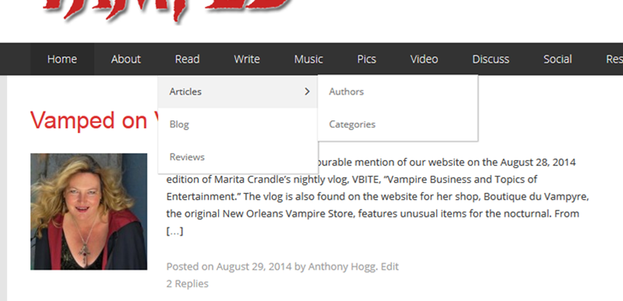
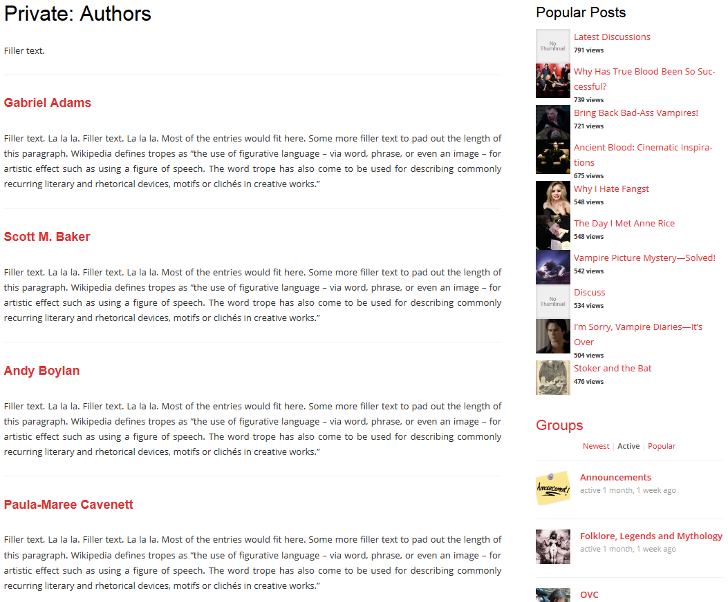
For each one of those elements, I intended to create separate pages—which turned out not to be a very design-friendly method. In fact, it’s strongly advised against. For the record, though, here’s what those pages looked like, behind-the-scenes. First up, the proposed “Authors” page:
And here’s what the “Categories” page was supposed to look like:
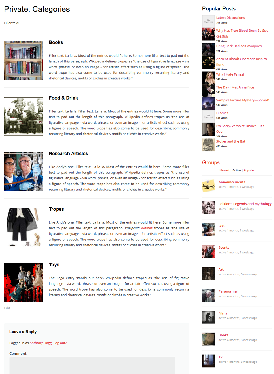
Although I hadn’t linked them in the “demo”, above, hyperlinks in the title would’ve re-routed to the respective categories; the filler text next to the thumbnail pics was a placeholder for the actual category descriptions that would’ve been hosted there. But yeah, that proved way too difficult to pull off.
Now, our collective writings are found in “Archive”, instead. Click on that, you see them all. Hover over “Archives”, though, and you’ll find our categories in its dropdown menu. The “Authors” page though is gone. Instead, if you want to see a list of our contributors, you’ll see them in the sidebar of our articles. Click on their names, it’ll take you to a list of their articles for this site.
“Music”, “Pics” and “Video” Have Moved
The “Music” tab was an attempt at creating a category page, like the kind mentioned previously. I used shortcode to display it, but it didn’t appear the way I wanted it to. Here’s what it looked like if you clicked on it:
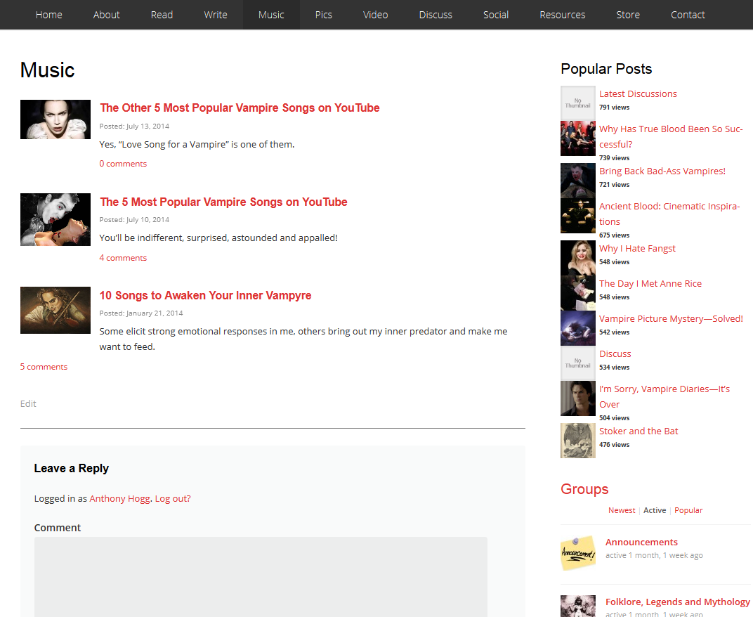
Now, the site’s “Music” section is displayed on our homepage, with the five latest entries in that category (we have three, total, as of this writing). To see the rest (when more eventually make their appearance), just click on the “Music” title and you’ll be re-routed to the default “Music” category page.
The same deal goes for the “Pics” and “Videos” tab, too—they’re also now displayed on the homepage, with the five latest entries (there are two for “Pics” and three for “Video” as of this writing).
“Discuss” Is Now “Forum”
There were three components to the “Discuss” page: “Forums”, “Latest Discussions” and “Discussions”. The first covered broad subject matters for discussion, the second covered the obvious and the third was across-the-board coverage of what was being discussed on the forums.
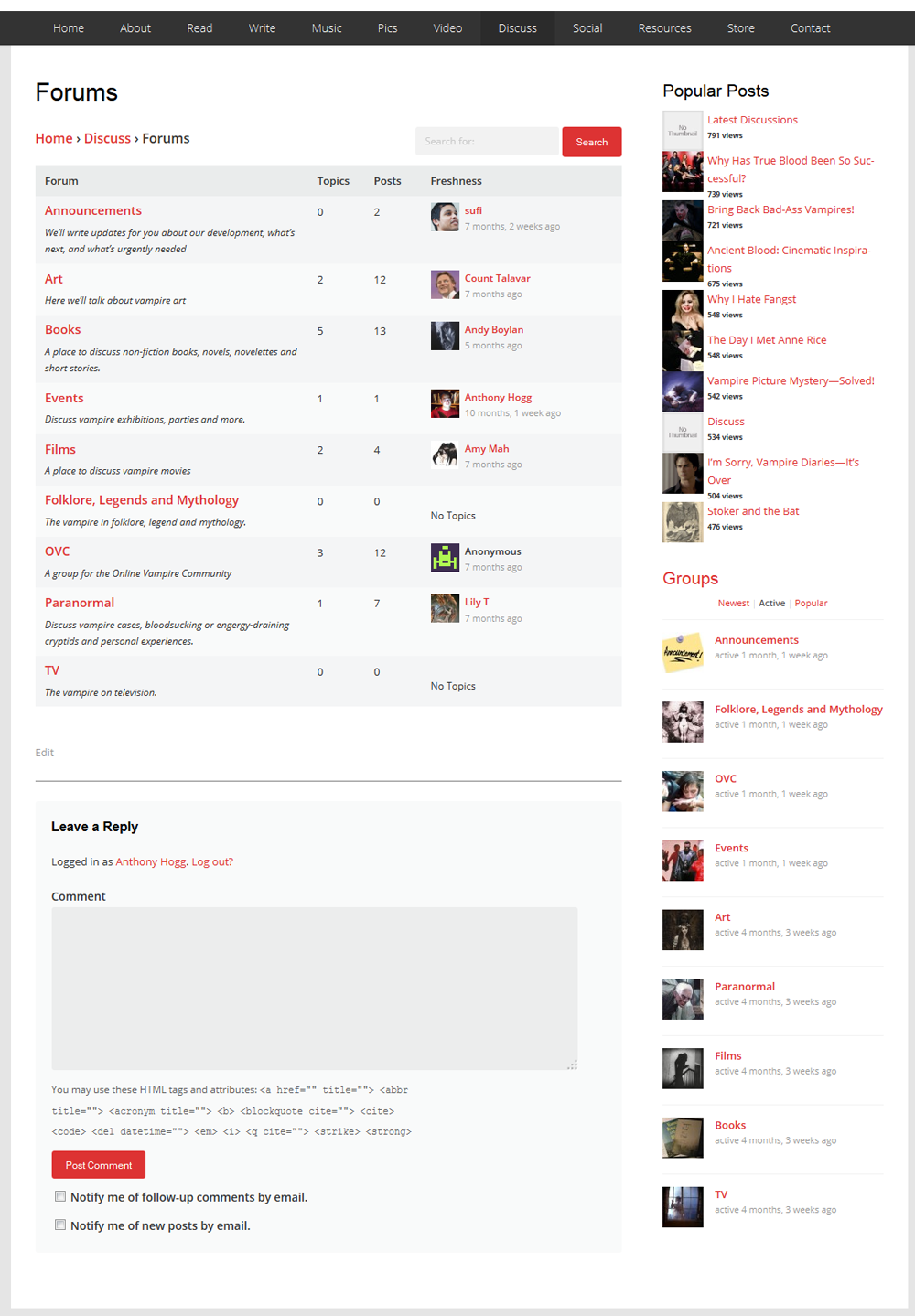
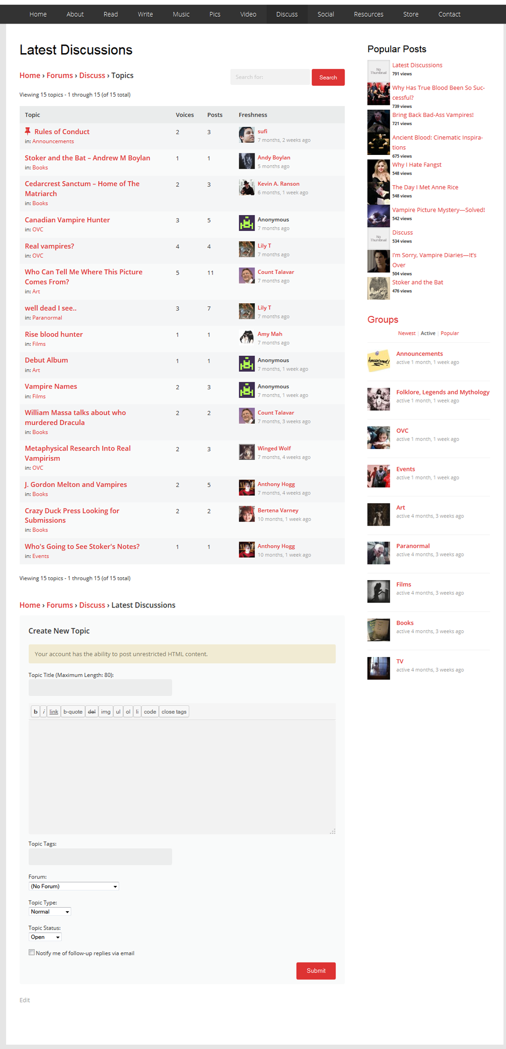
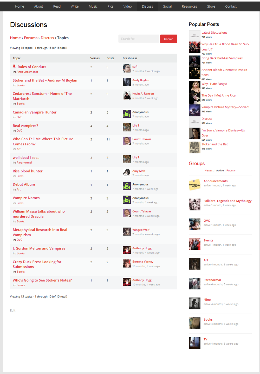
“Forum” is now the only one left standing from those three—though you’ll find them if you look around. However, in the long-run, I’ll be looking into a traditional, bulletin-board style forum.
I’ll ensure the current content isn’t lost, though: as you can see, I’m a stickler for preservation! Even more so, considering it was forum posts on the site that lead me to discovering the artist behind this awesome vampire pic.
“Social” Has Been Nixed
There were three elements to “Social”, too: “Newfeed”, “Members” and “Groups”.
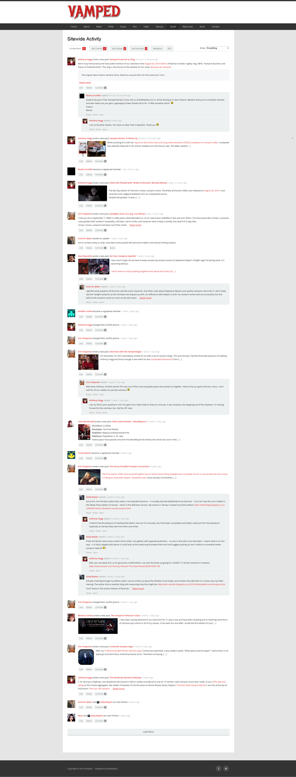
All members had their own “Newfeed” (called “Sitewide Activity” when clicked on), which kept them abreast of the latest updates and whatnot. Here’s what mine looked like:
The “Members” page was—believe it or not—a list of members who’d joined.
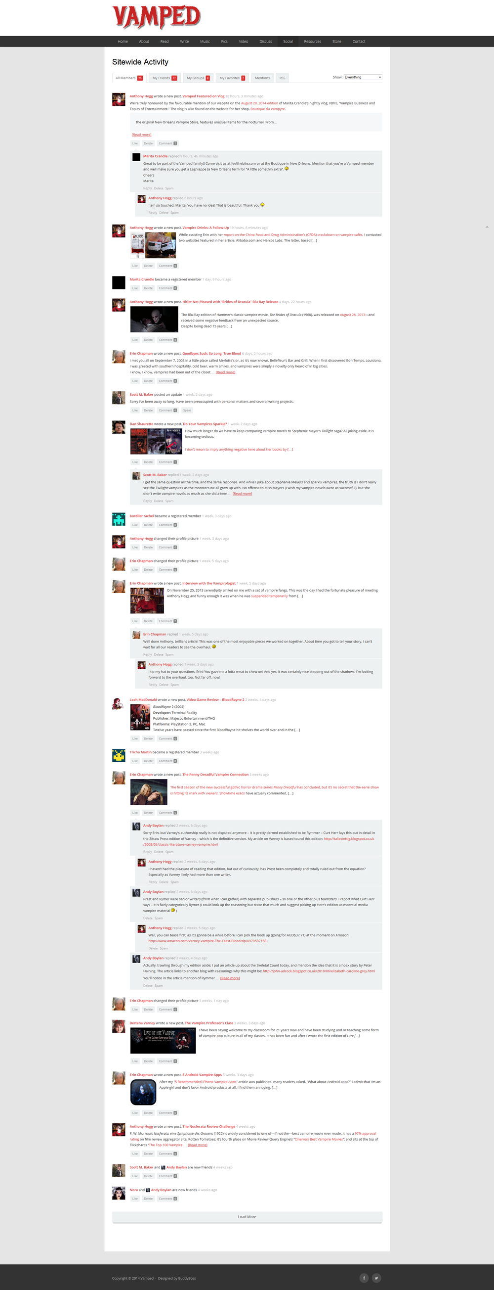
And last, but not least, “Groups” was—you guessed it—a link to the forum “Groups” on the site.
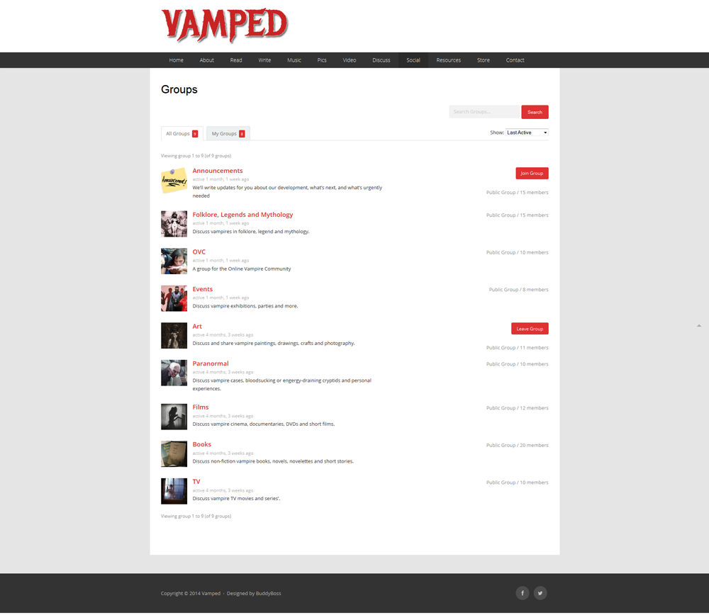
Those “Groups” will also be familiar from the sidebar display featured in several other screencaps here. So, yeah, these social network components to the site have been jettisoned for two reasons: 1) to streamline site usage, 2) they’re not compatible with the new site theme, 3) no-one, not even me, really uses them anyway. That said, they may resurface again in some shape or form, so we’ll see.
No More “Resources”
You’re not missing much with the culling of the “Resources” tab, considering this is what it looked like:
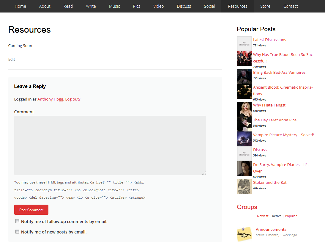
The idea was that it’d be a sort of directory; a listing of vampire clubs, recommended websites and the like. It may also resurface in some shape or form, but it’s been nixed for the time being.
Sidebar
So with the navigation menu out of the way, let’s take a look at the sidebar changes. There are actually two different sets, though: the “sidebar” on the homepage (actually an arrangement of widgets in certain sections) and the sidebars featured in the posts.
With the previous version of the site, all sidebars were the same—in posts and homepage—but now we’re dealing with a different kettle of fish. I’ll start with the changes to the previous version’s “homepage” and work my way through to the changes in the current version’s sidebars. Let’s go.
“Popular Posts” Is Now “Popular”—And Uses a Different Popularity Gauge
I won’t mince words: the “Popular Posts” widget’s appearance on this site—actually Héctor Cabrera’s WordPress Popular Posts plug-in—pissed me off. It looked shitty. That’s probably not the creator’s fault, could’ve been a theme compatibility issue. Either way, it didn’t gel with the site. Hell, it didn’t even have proper gaps between the thumbnails.
Fortunately, the theme the site now uses, has its own—much neater—popular posts widget. But there’s a catch: Cabrera’s plug-in widget does the obvious, by displaying the highest-viewed posts. The widget this theme uses, however, measures popularity by comment count. In other words, if you want your post to go higher up the list, get chatty in the article’s comment section!
I have messaged the theme’s creators about the possibility of measuring popularity by views, but they basically told me maybe, but not to hold my breath. So, I won’t. Who knows, may source out another widget plug-in in future, but this one will do for now.
“Groups” Is Now…Several Other Things
The “Groups” function had its own page and place in the navigation menu, as explained previously in this post. In its place, there are several different elements. There are two right above the “Popular” section: “Search” and “Subscribe.” I’ll describe the rest here, too.
Search
As its name suggests, typing in a keyword (or words) will allow you to isolate certain articles in the site that mention said word. Consider it our site’s “Google.” This widget also features in the article sidebars.
Subscribe
Are you one of those folk who check our site on a regular basis for updates? If so: show yourself! We have no idea who you are! But we’ve saved you a lot of trouble by adding the “Subscribe” bit. Just add your e-mail address to it, and our new posts will get sent straight to your inbox.
Blog
What you’re reading right now is a blog post. This is the section of the site where the site’s grand high poobahs—me, Erin and Sufi—talk about site changes, updates, announcements, that kind of thing. It’s not for standard articles, but will keep you up to scratch with things we’re up to. Consider it our “editorial”. It displays the latest five entries. To read the rest, click on the “Blog” title. And with that, we now move into article sidebar territory…
Stay Connected
We’re big on the social aspect of our website (and promoting our stuff!), so to that effect, you’ll find us on Facebook, Twitter, YouTube, Pinterest, Instagram and Tumblr. There’s also an RSS Feed, too. We’re all over the place! If you click on those buttons, you’ll be re-routed to the respective pages.
Connect with Us on Facebook
This one’s pretty obvious: with Facebook being the go-to social network for people these days (R.I.P. MySpace), we’ve added a widget that let’s you “like” our Facebook page. Join the party! We post new articles there and other random vampire articles of interest we stumble across.
Latest
A list of the five latest posts made on the site. Not much else to say about that.
Random
Same deal as “Latest”, but randomly generated articles on our site for your reading pleasure.
Authors
This is our contributor column. If you’ve written an article for Vamped, you’ll be on there. It also mentions how many you’ve written for the site, too. Click on a name, and the articles will be displayed for you. Now, with the sidebar features out of the way, let’s look at some things that weren’t on the previous site.
New Things
With the change, there’s many other elements we wanted to add, to enhance the site’s use and layout. Let’s take a look at ’em.
“News”, “Events” and “Win”—New Items in the Navigation Menu
We’ve streamlined the navigation menu: it’s currently 10 tabs down from the previous layout’s 12. We’ve also added three new items—which, admittedly, haven’t strayed too far from the drawingboard. At the moment, “News” hosts our “News” category posts, but the long-term idea would be more of a “feed”.
“Events” is intended to be a social calendar: if you’ve got a vampire event, ball, exhibition, whathaveyou, then let us know—or better yet, write an article about it for us, even if it’s a basic one, and it’ll get displayed there. We’re still sussing out exactly what we’re gonna do with that tab, though.
“Win” is just that—a chance to win somethingorother. We will occasionally host competitions ourselves, but we welcome (vampire-themed) prizes offered by authors, organisations and the like. Do a write-up about it, and it’ll appear there.
Homepage Display
Our previous homepage was a simple—yet effective—display of all our latest posts. Now, however, we’ve thrown in a few extra things and tinkered with what appears on there. Apart from the “sidebars” dealt with already, we’ve also added the following things.
Carousel
That thumbnail rotation of articles right beneath our navigation menu—it’s a carousel. It features 10 randomly-generated articles. Also, it makes things look “busy.” Which is good.
Editor’s Pick
The article enclosed in the big grey box underneath the carousel—that’s our spotlight widget. It will be used to showcase the site’s editors’ favourite articles. And yes, that will include our own. The articles are chosen by our editors; posts we wish to give special place to. You will also find them in a category of their own in the “Archive” dropdown menu as “Editor’s Picks”.
Article Display
Beneath “Editor’s Pick”, you’ll find the site’s five latest articles—but not including the ones written for the 6 categories listed lower on the page. No need for them to repeat themselves when they’re already given prominent display
Interviews, Lists, Music, Pics, Reviews, Videos
Remember what I did with “Music”, “Pics” and “Videos”? Instead of getting a tab of their own on the navigation menu, they’ve now got special “columns” of their own (along with newbies, “Interviews”, “Lists” and “Reviews”) beneath the site’s latest articles and above the website’s footer. The five latest articles from each category will be displayed there.
Footer
We didn’t have much of a footer before (it only included an icon link to our Facebook page and Twitter account)—now we have four columns. As of this writing, they’re “News in Pictures”, “Latest Articles”, “Recent Comments” and “Stay Connected”. All are fairly self-explanatory or covered already; except “News in Pictures” which is actually a 9 pic thumbnail display of pictures from our articles, sorted randomly. Click on one of those, as it will take you to that article.
I said, “As of this writing”, because Erin and I have mapped out what those footer columns are eventually going to display, but that’ll sometime down the track. In the meantime, they’re great placeholders.
Sitemap
If you look at the lower right hand corner of the page, you’ll see it there. Sitemaps aren’t something you often see on websites these days, but they’re very handy navigational aids. Ours lists the site’s “Recent Articles”, “Archives” (sorted by date), “Categories” and “Pages”. If you ever get lost or want to find something specific, go there.
Author Box
For authors who contribute articles to this site, there is a “Biographical Info” section they fill out in their user profile. The info there, displays in the author box now located beneath all articles they’ve written, along with a link to their website or Twitter page as a contact option. This feature wasn’t on our site’s previous design. The closet thing it had was an “Author Archives” display, found by clicking the author’s name at the end of their article. Here’s what Erin’s looked like, for instance:
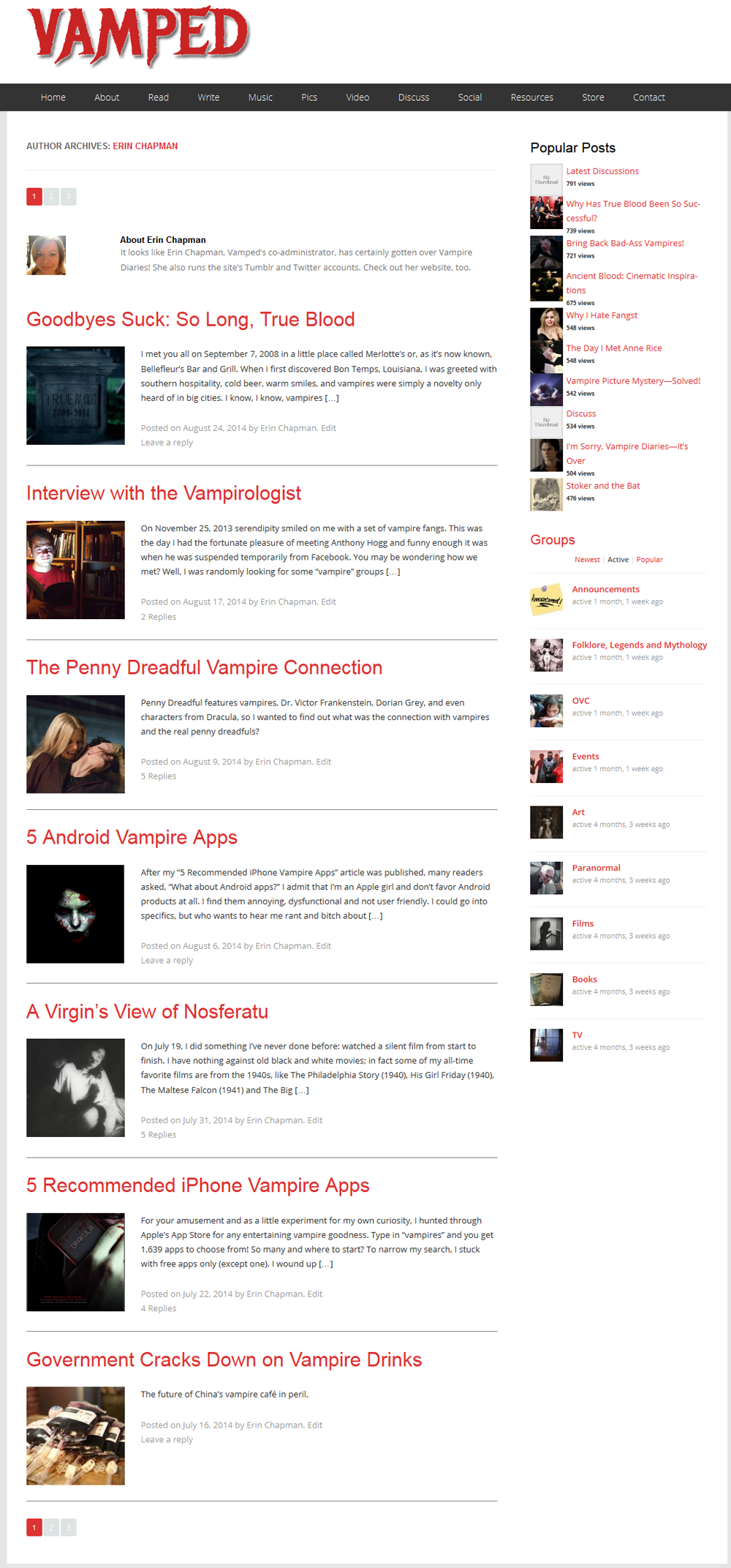
Note the content in the “About Erin Chapman” bit at the top, was a bit of a dummy text I copy-pasted into her “Biographical Info” section in her “User” profile. Now, that’d appear in the author box. There has been a change with displaying your pictures, though: if you don’t have a Gravatar profile, you’ll need one now. The Gravatar profile you create must use the same e-mail you use for this website. Click here to create your Gravatar profile. If you’re an author for this site—or want to be one—you’ll need a two or three sentence bio, 50 words, max, to fill in the “Biographical Info” section of your user profile.
So with all that, what’s to come? What’s in store for the site? Are there any other things we have up our sleeves? You bet your ass there is.
What’s Coming Up?
Mark Zuckerberg (Jesse Eisenberg) says it best in The Social Network (2010): “It won’t be finished, that’s the point. The way fashion’s never finished.” There are many things I want to do for this site—and there are many things that still must be done.
Revisions
The “About”, “Write” and “Contact” page will all be revised. Significantly. The “About” page will give a greater insight into the site’s formation and do a more effective job telling its tale. The “Write” page will be re-written to a higher editorial standard, to give a clearer idea of what articles should do and be about, their length, all that stuff, for this site. The “Contact” page will feature extra fields, to customise the responses we receive. Also, so we can better anticipate what they’re about in the subject line.
Fill the Empty Pages
As mentioned, the new additions to our navigation menu need something in them. We’re still working on that—but the onus is on us to get the word out. For one that already existed and is also empty—”Store”—we’re shopping around (geddit?!) for something to add to that section. What I can tell you, though, is that it’ll be a benefit to the authors writing for this site, because we will be hosting their vampire books.
Membership Benefits
As I noted in my first post for this site,
I want this site to preserve the spirit of my Facebook group: free and open discussions on the subject and its various aspects, under the banner of a respectful community. I’m particularly humbled by the fact that my group is composed of people with differing levels of personal investment in vampires, but show enough tact, humour and friendliness toward each other, that conversations are often insightful and rewarding—even when opinions are diametrically opposed! I tip my hat to them all.
We couldn’t do this without you. The readers, the contributors, the people who share our articles: you help keep this site going. So how do we reward that? That’s where things like competitions, event calendars and whatnot come into it. But there’s gotta be more, too. We’ll think about what we can offer you, and that will be reflected in the site’s new direction, especially with word about our work getting out.
Marita Crandle, the proprietor of New Orleans’ Boutique du Vampyre even extended a beautiful (and totally unexpected) offer for members who patron our site:
Great to be part of the Vamped family!! Come visit us at feelthebite.com or at the Boutique in New Orleans. Mention that you’re a Vamped member and well make sure you get a Lagniappe (a New Orleans term for “A little somethin extra”.
That’s what we like to see. Feel the love! We recognise the importance of promotion—not just from a business perspective, especially as we haven’t made a single cent since creating this site—but as a network, a social network for vampire fans, writers and artists. We’re all in it together.
Mailbag
You know how newspapers and journals have letters to the editor? I’d love something like that for this site. Erin made a similar suggestion earlier this year as “Ask the Vampirologist”. And I’d be happy to. I often find myself answering questions on various Facebook groups, so why not here, too? It doesn’t even have to be overly serious: I once helped someone track down a tampon case called “Vampire Teabags”. Why? For the hell of it!
Feel free to e-mail me via the contact page. One catch, though: I’ll need your permission to reproduce your message and details (as I did for a Harcos Labs representative, recounted in my article on vampire drinks).
Conclusion
There’s so much more I have in mind, too. The more time I spend on this site, working with my colleagues, the more invigorated it makes me feel—and I want to share that passion with you. The new site design was like buying a new suit: it makes the “body” much more presentable and instils it with a greater sense of confidence. I hope you like it, too.
I’m always open to feedback—and (constructive) criticism, so feel free to share your own suggestions and ideas. Together, we can make this site great. Thanks for reading!