Greetings! And welcome to one of my tedious, pedantic blog posts covering website minutiae and other developments, probably of no interest to anyone but myself. Nonetheless, I figure I’d give you the option of being informed of latest developments rather than say nothing, even if some of you probably prefer it that way. Anyway, without further ado, here’s what’s been happening!
Post Formatting Changes
On Monday, I shared a link to my interview with Lionel Fanthorpe (September 29, 2014) to a friend of mine on Facebook. She made references to gaps between words in the article, adding “u write well but I don’t get why u use bigger gaps in between letters sometimes like other writers lol”. It took me a while to twig on, but I had my Eureka! moment: “. . . i’m not sure what you mean about the gaps, except i think maybe i do now…did you read it on your phone?” “Yes I did”
That’s when I realised what happened. There were no gaps in my post; my friend was actually referring to the way viewing our articles on a phone “stretches out” the text, because I use “justify” text alignments on our articles. It looks nice and pretty on a desktop or in a book, but on a phone—or other small device, like iPads—it stretches the text out, leaving “gaps.” I’ve noticed that happening when I read articles on my phone, you’ve probably seen it happen on yours.
My friend’s Facebook commentary served as the final incentive to change how I post things here. Yes, I was aware of it, but didn’t think it was that big a deal. Clearly, it is. After all, readability trumps prettiness. So, no more justify text (sob), only default alignments from here on in! Ride the whirlwind, baby!
The first post to get the default treatment? Another interview, funnily enough: the one I conducted with Lauren Adkins (October 2, 2014).
Oh, and speaking of interviews and format changes and whatnot, you’ve probably also noticed that I’ve stopped using a horizontal line to divide post content from the little asides I write at the bottom of posts. In fact, I began doing that in my Fanthorpe interview. Why? Because it looks shitty. The line’s too thick and I don’t know how to thin it out. Besides, italicised text on the bottom of the text, on its own, looks clean enough.
Interview Format Changes
You might also have noticed a change in how our interviews are formatted, too, by comparing my Fanthorpe interview with Erin’s interview with Andy Boylan (September 3, 2014). Why’d I change it? I felt the format could look better.
So, I went Googling for other examples and found one I liked: check out BJ Gallagher’s Huffington Post interview, “Shakti Gawain Is Still ‘Living in the Light’” (September 5, 2012 5:44 p.m. EDT; updated November 5, 2012, 5:12 a.m. EST).
I also turned to The A.V. Club for inspiration, specifically Vikram Murthi’s interview, “You’re the Worst Creator Stephen Falk on a Sideways Approach to Romantic Comedies” (September 18, 2014, 10:00 p.m.).
We’ve Been Showcased!
As noted in my “Major Overhaul” post (September 2, 2014), a lot of work’s gone into changing our website’s look—and it hasn’t gone unnoticed.
Yesterday, we emailed a coupla technical questions to the company Erin purchased our site’s theme from: how do we hide meta tags in posts and how do we stop internal links from appearing as comments?
Shortly afterward, they wrote back with solutions, adding, “By the way, we like your site and would love to add it to our showcase” and “Can you please send us a testimonial (50-60 words) so that we can add your entry?”
Could we? Hell yeah! Funnily enough, before that unexpected request, we had some inkling the company was a fan of our site. Specifically, through their September 2, 2014 Facebook page post:
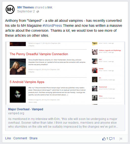
In fact, Erin and I only became aware of that post when we were Googling about for our site yesterday. Talk about serendipity! Anyway, today, I bashed out a 55 word testimonial for them:
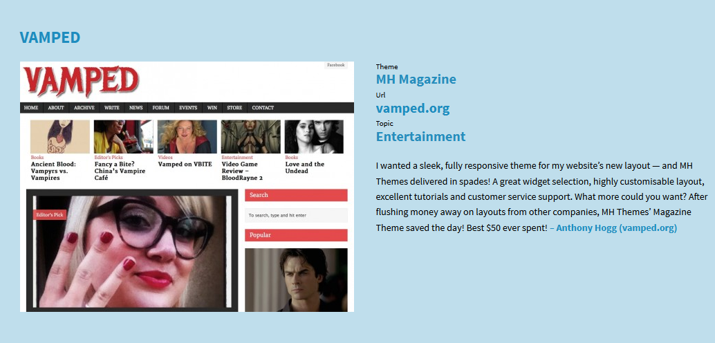
I wanted a sleek, fully responsive theme for my website’s new layout—and MH Themes delivered in spades! A great widget selection, highly customisable layout, excellent tutorials and customer service support. What more could you want? After flushing money away on layouts from other companies, MH Themes’ Magazine Theme saved the day! Best $50 ever spent!
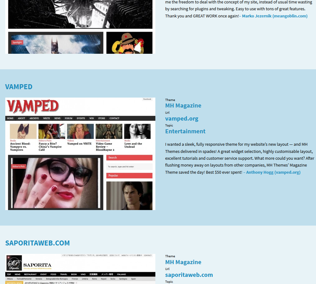
They posted it on their showcase, along with a screencap of our website, within half an hour of me writing it and Erin sending it along. Those guys don’t fuck around! Here it is:
Naturally, we’re incredibly honoured to feature on MH Theme’s showcase—and I meant every single word in my testimonial. Seriously. I once spent about $100 on a special 50 theme pack—and wound up using precisely zero.
In the wake of the showcase business, Erin responded to the shout-out on MH Theme’s Facebook page: “We have to say your support team has been amazing! Props to them for being so helpful and prompt.” They responded 10 minutes later with, “You’re more than welcome! Feel free to recommend us to your blogger friends and friendly vampires.”
So, that’s what we’re doing. If you’re a blogger friend, friendly vampire—or both, we don’t discriminate—and you’re looking to start your own website, boy, has MH Themes got some excellent layouts for you! Here’s their website. Check them out. You won’t regret it!
Photo Captions & Referencing
Photo captions. Notice how I give photos a credit underneath pics in the articles published on this website? Until fairly recently—embarassingly recently—I’ve still been sussing out a decent way to do it, without using something that’d turn it into a bibliography in its own right. Fortunately, I’ve hit on one that works: AP Style.
Associated Press style holds that the photo publisher comes first, then the photographer. Now, to me, if a photographer isn’t identified, I’d go by an online username or corporate account. Take that MH Themes Facebook post I cited up there (“Facebook/MH Themes”). Facebook is the “publisher” (after all, MH Theme’s message was hosted on Facebook, not their own site), MH Themes is the “photographer” or source in this case. Well, that’s the logic I’m using, anyway. I could be wrong.
I have experimented with the format before, but sometimes put photographer first; for instance, the credit I gave Kelan Bonislawski, had his name before Flicker, in my September 2, 2014 update on the “Writers Wanted” post (November 1, 2013). But it should’ve been the other way ’round.
While writing this post, I’ve also come across an interesting article by Tracey Eaton called, “AP Style Tips on Photo Captions” (Writing • Multimedia Storytelling • Journalism• by Tracey Eaton, January 16, 2014). Its advice could be very handy for future captions. I guess I’m still finding my way when it comes to a “standard” for the site, but the spate of news articles on here are certainly setting a benchmark.
Incidentally, there’s a reason why post times are often added to the newspaper articles we’ve been citing here, as opposed to other article citations. Those times (if they’re included in an article) signify that present edition of an article. Sometimes, they get changed and updated.
For instance, while Erin and I were working on her breaking story, “Government Cracks Down on Vampire Drinks” (July 16, 2014), one of the articles we cited—Chris Luo’s South China Morning Post article, “‘Vampire Drinks’ Banned by China’s Food Safety Authority” (July 15, 2014, 5:53 p.m.; updated July 16, 2014, 12:28 p.m.)—got updated while we were writing, and we wanted to establish that we were quoting from the story’s most recent “version.”
Not all stories get changed, of course, but you never know when they will and posting a time at least makes it clear that an earlier version of the article was cited, in case it changes when a reader visits it after any changes have been made. It’s admittedly cumbersome and not the prettiest thing to look at, but at least it’s accurate.
As I hone our “style”, it’ll get incorporated into an updated version of our “write” page, which, yes, Erin, I will re-do at some point in time. Just don’t expect it any time soon, because October’s gonna be chockers!
You’re right Anthony! October is gonna be chockers. I have to say after all the grief we went through struggling with other themes I am so happy with this one. Also love the formatting talk lol! If someone didn’t know you they would say you are totes geeking out 😛
Heh heh, well, it does surface from time to time! Shit, maybe I am! AIIEEEEEEEEEE!!!
Haha! You know you are, but hey who am I to talk lol?
You’re Erin, Erin! Erin Chapman! You can talk anytime! 😀